
Pick up your phone and open whatever app you use most and odds are the buttons you tap all day live along the bottom of the screen. Home, Search, Messages, Your Profile.
Now look at your computer. Your Mac’s Dock or your Windows taskbar sits along the bottom edge too, holding all the programs you open fifty times a day.
Then open a typical business website on either one and the navigation is crammed into the top of the page, scrolls away the moment you start reading and on a phone usually hides behind a tiny hamburger icon in the corner furthest from your thumb.
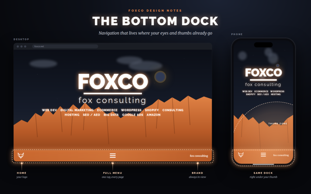
And that’s why we build most of our sites with a bottom dock header. It’s a navigation bar pinned to the bottom of the screen on phones, tablets and desktops alike, holding the handful of things visitors actually come to do.
Everyone already knows how a dock works
The bottom of the screen is where people’s tools live. On phones the big apps moved their main navigation there years ago, and companies with enormous research budgets tested it and built their whole interfaces around it. On computers the dock and the taskbar have been at the bottom for decades. Your visitors use bottom navigation for hours every day on every device they own.
A website that uses the same pattern doesn’t ask anyone to learn anything. It feels like part of their device instead of another page they have to figure out.
On phones it’s about thumbs
The top-of-the-page header is a habit carried over from desktop design, where a mouse can reach any corner with the same effort. Phones don’t work that way. Most people hold their phone in one hand and navigate with their thumb, which comfortably covers the lower half of the screen and has to stretch, shuffle or call in the other hand for anything up top.
Phones keep getting taller and that top corner keeps getting further away. A menu that was a minor stretch a few years ago is now a two-handed operation on a lot of current phones. A bottom dock puts navigation where the thumb already is.
On desktop it’s about focus
On a computer reach isn’t the issue -- a mouse gets anywhere. The issue is what the top of the screen is for. That’s where the eye lands first and it’s prime real estate, so we’d rather give it to your headline and your best image than to a row of menu links.
Moving the navigation to the bottom lets the page open on what you actually want people to see. The dock is still there whenever they want it, sitting where they’re already used to looking for their tools.
One navigation everywhere
Most sites run two navigations: a full menu bar on desktop and a collapsed hamburger version on mobile. That means two layouts to design, two to maintain and a visitor who checks your site on their phone at lunch and on their laptop that evening has to find their way around twice.
A bottom dock works the same on every screen size. Same position, same items, same order. It’s one less thing for your visitors to think about and one less thing for us to keep in sync.
Hidden menus don’t get used
The hamburger menu solved a real problem, which is fitting a full navigation onto a small screen. The trade-off is that everything inside it is invisible until someone decides to go looking. Plenty of visitors never open it at all, which means your services page, your contact page and your booking page may as well not exist for them.
A bottom dock keeps the three to five most important destinations on screen at all times. We pick them to match how the business makes money -- call, book, get a quote, shop, find the location. The full menu still exists for everything else; it just stops being the gatekeeper for the stuff that matters most.
The call to action never scrolls away
A standard header scrolls off the top of the screen within a second or two of reading. If someone gets halfway down a page and decides they’re ready to call you, they have to scroll back up or hunt for a button buried in the content. Some of them will. Some of them will get distracted and leave.
With a bottom dock the call button, the quote button or the cart is one click or tap away no matter how far down the page someone is, on any device. That’s the part that shows up in the numbers. Making the next step effortless at the exact moment someone decides to take it is about the most reliable conversion improvement there is.
Details matter
A bottom dock done badly is worse than no dock at all, so a few rules come with it:
If you want a bottom dock header let us know and we'll get you one.